My home server was briefly offline yesterday and today due to me fiddling with the NIC driver.

Looks odd to see the outages as “blanks”. I think they used to show red score dots to show lost packets. Was this change intentional?
My home server was briefly offline yesterday and today due to me fiddling with the NIC driver.
Looks odd to see the outages as “blanks”. I think they used to show red score dots to show lost packets. Was this change intentional?
Well, and the text “Jul 23” 6 times on the horizontal scale isn’t very informative.
My first intention is that “blanks” are right because the monitor cant reach your server and don’t get any data. ![]()
All the red dots are back! Thanks @avij.
Last weekend I modernized ~all the frontend javascript and how it’s built & deployed and in the rewrite I missed a subtlety with zero offset data.
@NTPman oops on the x-axis legend. I’ll figure that out.
Thanks!
As an aside if anyone wonders, as mentioned, I’m debugging one particular NIC driver and making my own development builds of it. I may need to reboot the server frequently during this development time and this may lead to getting a new DHCP lease more often than usually. The server’s IP address has changed again. I’m not putting this server in the main pool due to not having a static address, but it’s good enough for the test pool. Once the situation with the NIC driver stabilizes I’d expect the IP address to stay more constant.
Barely working servers are great for the test pool. More scenarios to test!
I’ve written a simple NTP simulator (probably not the only one out there) that lets you tweak things however you like:
It was originally built for personal use, so there’s no documentation or anything, but it should be fairly self-explanatory.
Feel free (you or anyone else) to add an instance to the beta pool. ![]()
I fixed the the x-axis legend in two tries, and the negative score display.
Done!
Expect ‘horror’:
I’ve configured it as shown below, but it is already complaining about ‘bad stratum’, so perhaps I should configure that different. What is the highest stratum that is deemed valid ?
DISCLAIMER:
I can’t tell how long I can let it run like this, so future readers may miss out on the fun.
{
  "port": 123,
  "debug": true,
  "min_poll": 6,
  "max_poll": 10,
  "min_precision": -29,
  "max_precision": -20,
  "max_ref_time_offset": 60,
  "ref_id_type": "XFUN",
  "min_stratum": 1,
  "max_stratum": 15,
  "leap_indicator": 0,
  "version_number": 4,

  "jitter_ms": 10,
  "drift_model": "random_walk",
  "drift_ppm": 50.0,
  "drift_step_ppm": 50.0,
  "drift_update_interval_sec": 10
}
For the x-axis length I prefer YYYY-MM-DD (e.g., 2025-07-25).
The new status page looks realy nice ![]()
Hi @marco.davids – this is really helpful!
Your broken server actually helped identify a color problem with the charts. When everything’s failing like yours was, it became clear we couldn’t distinguish between different types of issues - everything just looked “broken.”
I changed the colors:
Scores are now purple/dark blue for negative steps (was red)
Offsets are hot pink when too high (was red)
Orange remains for “in between” values
The changes should also work better for colorblind users (tested with Sim Daltonism).
This also highlighted a quirk in the new selector: no monitors get chosen as primary because none are working. Selection uses recent “step” values, not scores, so once you fix the server it should recover (though it’ll take some time).
The stratum cutoff is 7 - stratum 8+ gets negative steps.
(Edit: oh, the client had a lower threshold for just throwing an error. I’m updating the client to allow stratum up to 10 before it returns the test as an error, but the scoring will require 7 and below. This all feels a little dubious. I think the limit is there because in the past I observed a correlation between high stratums and “soon the offsets will be nuts”, but I think the scoring system will react faster now to the offsets so this is less necessary.)
In development, I’ve tightened scoring to require ≤25ms offset for perfect scores and ~100ms to stay in the pool. Production currently uses 75ms/250ms. In practice it’s stricter since timeouts or network blips will pull you down if you’re borderline. Your tester will be great for validating this.
Yeah, me too. I fixed it up for now to use UTC and 24 hour clocks, but the YYYY-MM-DD format looked weird(er) when at most there’s 1.2 days of data shown.
I have a branch for the data API to extend the API to allow selection of dates to allow for graphs over longer periods. I haven’t figured out the downsampling yet; it’s pretty tricky with the amount of data. What I’ve been fussing with is using an average or median and then having data points for the 5th / 95th percentile offset values (high and low) and figuring out how to represent the score and maybe the volume of tests (or filter out monitors with too few tests in a period).
I might need to change the monitoring system to collect the current status of the monitor so we can filter on that after the fact; which will lead to another bunch of yak shaving most likely.
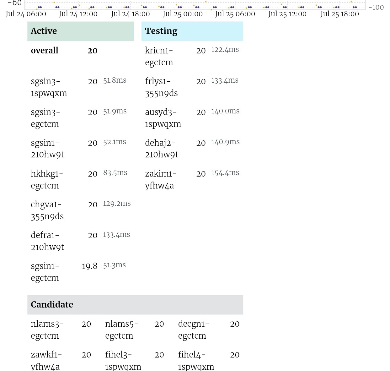
I see you implemented something I was going to suggest: With the much larger number of monitors, put them in two colums rather than one very long one (and move the overall score back to the top of the list). Nice, also with the delay (or RTT?) added! ![]()
Maybe the spacing in the table could be improved a bit. At least on a small screen device (tablet), there is line wrapping, while there would be enough space to avoid that (with the graph anyhow taking more space horizontally). And even if everything were on one line, a bit more space before the score would increase legibility (at least I found that with the interim “thin” one-column design that directly preceded the 2-column one, not sure what the spacing will be once the line wrapping is addressed).
I have a few more small nits for your consideration, but didn’t get around to compiling them today. A few off the top of my head:
That’s all that came to mind right now. Have another item for the monitors page, will post that tomorrow. And maybe more minor nits I forgot above.
@ask, I see you’ve already done some updates, looking good!
Very small items only on the server details page:

Thoughts regarding the monitors management page:
I understand some of the items mentioned are really small ones, and many, if not most people would care, or even note them. I happen to note such things, so just sharing for your consideration. And I understand that the pages should look nice, and a lot of effort could go into perfecting the web design. But the Pareto principle obviously applies, certainly for the optical aspects of the pages (and I’d rather have you spend your precious time on functional improvements).
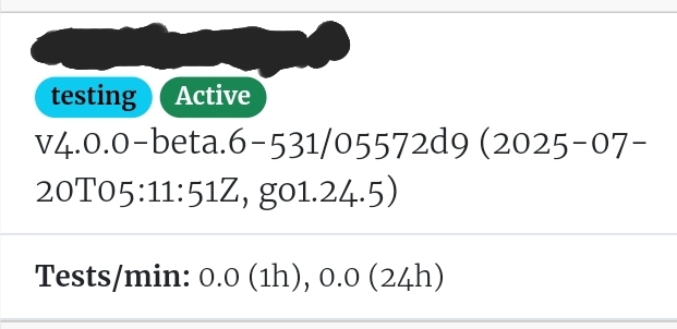
A bit related to the status shown in the respective monitor cards: Even after reading some of the descriptions in the GitHub repository, I am not sure how/whether the status shown in the monitor cards relates to the status that a monitor has for a specific server, as shown in the table on a server’s detail page.
I guess while the state word is similar (e.g., monitor status “testing” for not-yet-approved monitors, vs. the “testing” category of monitors on the server detail pages), the two are two separate things. As a monitor that is not yet approved itself will already poll servers to assess the monitor’s performance/health/suitability, but will/should obviously not be considered for actually evaluating/scoring a server.
I am just a bit confused as I have the impression that sometimes, some of my not-yet-approved monitors appeared in some servers’ “candidate” section. I haven’t found a pattern yet, though, as to when that happens vs. apparently most of the time, not-yet-approved monitors not showing up on a server’s page (as it currently seems to make more sense to me).
Similarly, I sometimes had the impression, even somewhat recently, that (some of) my own monitors were also appearing on some of my servers’ pages (which I understood should not happen with the new constraint system). But I couldn’t find a pattern, and I have not seen that in the most recent past, so might not be happening anymore today.
Lots of text/thoughts, probably too long already, so I’ll leave it at that, and for your consideration.
EDIT: Just added a new server to the beta system, and multiple of my own monitors are among the “Candidate” or “Testing” servers, including some that have not been approved yet. So maybe I misunderstood, and the “constraints” are not applied initially, but only over time as part of the overall selection mechanisms, and as other kinds of input data become available as well, e.g., measurement data as well, to get the overall picture in all dimensions. Let’s see how that evolves…
Thanks for the list! Feel free to file GitHub issues, too, it might be easier to track (lots of small issues are fine). I’m going through the list as carefully as I can, but feel free to call out if I miss or misunderstood anything.
You might also be able to prototype fixes in the web inspector if you want.
I’ll push these changes now and continue on the rest of the list later!
I usually prefer that as well, exactly for those reasons (and it better shows the intent, rather than a verbal description). Unfortunately, I continue to struggle understanding how the templating system is dynamically assembling, let alone modern web technologies…
I can’t immediately find it anymore right now, and another example of a deleted server looks as intended. Will share should I stumble across an example again. In any case, the point was less on the data not being there anymore for a deleted server, but more generally what is shown when something happens (earlier examples in various threads were typically caused by some temporary issue in the backend for server that did still exist). E.g., here, but also more recent examples.
As mentioned, some items are really just small things and not pressing, including the alignment topic. Maybe something for another day, when the more pressing functional aspects are done…
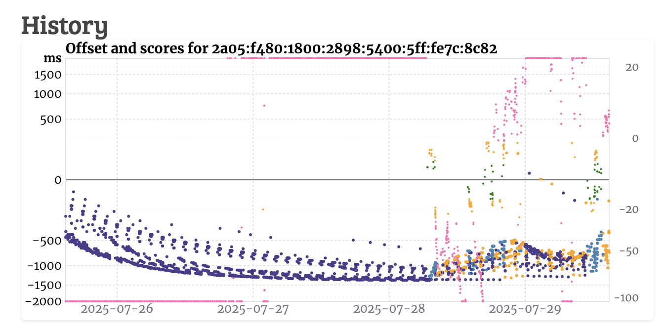
Some graphs may be copied and survive for years. I’d like to at least see the year included.
Maybe add the full date once, e.g., before the first label so there is enough space to fit without another label cramping the space. Then, given the short timespan covered by the graph, only the day of month, or weekday, could be given for the other labels, allowing to deduce the full date.
Or put the full date elsewhere entirely, separate from the axis labels, with a clear definition how to interpret it. E.g., that it pertains to the first, or maybe better, last label (kind of embodying the point in time when that particular graph snapshot was captured) present along the x axis. Or the right edge of the x axis, regardless of whether it has a label (according to the usual interval for the current time span displayed) or not. Again, with the limited time span the graph covers, deducing the month, certainly the year for the labels that don’t include those components explicitly should not be too difficult.
EDIT: I just realize that the current production system has a variant of the above, not including the year though: At least as of right now, the right-most label on the x axis is the only one that has the month plus day of month, whereas the other labels alternate between time only, and day of week plus day of month at the currently covered time span of ~4 days.
New settings (stratum within accepted limits and drift a little less):
{
  "port": 123,
  "debug": true,
  "min_poll": 6,
  "max_poll": 10,
  "min_precision": -29,
  "max_precision": -20,
  "max_ref_time_offset": 60,
  "ref_id_type": "XFUN",
  "min_stratum": 1,
  "max_stratum": 6,
  "leap_indicator": 0,
  "version_number": 4,

  "jitter_ms": 0,
  "drift_model": "random_walk",
  "drift_ppm": 5.0,
  "drift_step_ppm": 5.0,
  "drift_update_interval_sec": 10
}